Snake River Alliance Adopts a New Logo
By Amy O’Brien and Bryant Kusy, Board of Directors

 Based on feedback from members, Snake River Alliance staff and board members concluded it was time to update the logo to better reflect our organization’s dual mission. Creating a new logo was exciting but a bit daunting as we wanted to incorporate all the elements that the Snake River Alliance stands for…anti-nuke and clean energy while honoring the history of the organization’s activist beginnings.
At the start, we established a committee of staff and board members to coordinate the logo design process. We secured new funding and hired a national creative team to assist with the design effort. We also knew we wanted to solicit ideas and incorporate feedback from a broad range of stakeholders at every stage of the design process.
Our committee asked people to vote for favorite color palettes and logo styles as a jumping off point for the graphic design team to explore. We went through at least five rounds of various approaches to logos asking for tweaks in the symbol, font, and color to hone in on the ideal graphic. We contemplated logo ideas that included Idaho imagery, nuclear reactors, the sun, rivers, waves, paddles, modern triangles, and even electric leaves. We researched historical images from the Alliance, vintage anti-nuclear campaigns, graphic posters, and buttons for inspiration. Along the way Leigh and Holly revealed artistic talent by mocking up sketches to share with the design team based on the feedback.
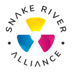
Round after round we sought to design a logo that included anti-nuclear imagery and embraced clean energy imagery. By the fourth round, the radioactive “trefoil” magically appeared in the negative space around the clean energy fan blades of the logo. We took a chance and asked the design team test out bright pink and blue for the fan blades, utilizing the original colors of the trefoil designed in 1946 at UC Berkeley (Nels Garden & team), and adding the yellow from the current incarnation.

Thus, the new Snake River Alliance logo with its blades in motion looks simple, but has a legacy both historically and in our collaborative process. You can make out the nuclear symbol in the negative space, but the clean energy blades, say of a windmill, speak to a different vision. The new (clean) swipes away the old (decay) for the Snake River Alliance’s twinned mission for Idaho. This powerful symbol has motion within it, energy. It sticks in the mind. And like a windmill, can be seen from far away in stark contrast to an antiquated and perilous past that was nuclear. As members of the logo design committee, we hope you are pleased with the new logo!